
What we needed:
- An innovative design that stands out, particularly on the front cover, that makes our audience interested and willing to buy it
- Photos of our band to identify the artist with the music
- Include a bar code, record label and copyright information
- A colourful, quirky and handmade aesthetic that synergises with the branding of our other products
We created the album cover on Adobe Photoshop. Photoshop was a perfect piece of software to use as it includes many tools and options that would allow us to make our album cover the way we wanted it. Furthermore, all of us had a good understanding on how Photoshop worked; Noa in particular is very confident in using the software and finding her way around it to create our intended effects.

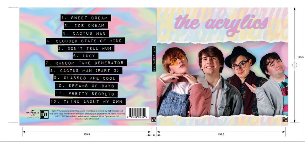
The first thing we needed was to place the photos of the band members on the front cover of the album. To do this, we selected the pictures we wanted from our studio promo shots, then coloured the backdrop a different colour (we used blue) to obscure the white areas. We then used the quick selection tool to select the coloured area of the backdrop and delete it. By colouring blue, the area was easier to select and also caught more areas of the backdrop than if we'd used the quick section tool on the original image. One thing I learned was that by selecting the outline of the band member and right clicking on the image, you could change the quality of the outline by sliding options such as 'Contrast' and 'Feather' to make the outline less harsh. We also selected to create a New Layer with Mask. This meant we could erase any remaining areas of backdrop from the images without erasing parts of the original image.

Another thing we needed was to create a colourful backdrop. We decided that as our band name is The Acrylics, we would create a paint like backdrop for our outside panels. To do this, we created a page of colours (blue, pink, green, yellow) and swirled them using the blend tool. This created the effect of paints mixing and, when adjusted in brightness and colour balance, the result is a very pretty background that is light enough to not make the front panel too busy.

Photoshop also allowed us to place bar code, record label and copyright information onto our back panel.


Photoshop ticked all the boxes for our needs. It lent us lots of effects and allowed us to accomplish all of our original designs, as well as helped facilitate the designs we wanted later. It was easy to use, and despite some problems we encountered when using the software on one of our computers, we were very happy with the software.
My contribution
During the construction of the website, I :
- Contributed my ideas for the layout of the album cover, including how the band members should be arranged on the front
 |
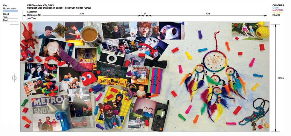
| Construction of the Digipak's second draft |
- Helped Noa on Photoshop with the creation of the background

Challenges we faced and how we overcame them:
Our original plan for the front cover was to have the band members decreasing in size, with their feet at the bottom of the panel and their bodies standing in a line gradually getting smaller and smaller from left to right. When we attempted this, we realised that the faces of the band members were hard to see clearly and their bodies looked a little odd. After getting feedback from our target audience, we found out that they too would change the way the band members were arranged, Therefore, we changed the framing to a mid shot and placed the band members slightly behind each other in a line. This way, the faces were easier to see, making them more identifiable to an audience, and the overall look of the front cover improved.
Another problem we faced was that Photoshop suddenly became very difficult to work with mid way through the construction process. The software was difficult to use, certain tools and key commands were unresponsive and the layout could not be rotated to access the other side of the digipak. We managed to overcome this by switching computers.
Here is our finished digipak album cover:

Our original plan for the front cover was to have the band members decreasing in size, with their feet at the bottom of the panel and their bodies standing in a line gradually getting smaller and smaller from left to right. When we attempted this, we realised that the faces of the band members were hard to see clearly and their bodies looked a little odd. After getting feedback from our target audience, we found out that they too would change the way the band members were arranged, Therefore, we changed the framing to a mid shot and placed the band members slightly behind each other in a line. This way, the faces were easier to see, making them more identifiable to an audience, and the overall look of the front cover improved.
 |
| Construction of the Digipak's first draft |
Here is our finished digipak album cover:

 |
No comments:
Post a Comment